fbpx
Category

Blog

Lessons Learned and the Way Forward in the Wake of the Pandemic

By | No Comments

September 2021 Michael Cummings, Sr. Principal
I was fortunate to participate in an International Cinema Technology Association panel discussion at CinemaCon.  ICTA President Frank Tees served as the moderator and ICTA Vice President (International) Jan Runge interviewed Thomas Van de Weerd, proprietor of the (Any)thing cinema with their first private cinema located in the Netherlands.  I was joined on the panel by creative, passionate, and driven exhibitors Tim League of Alamo Drafthouse, Bobbie Bagby of B&B Theatres, and (via video) Crispin Lilly of Medi-Cinema and former CEO of Everyman Cinema.

The exhibition perspective on lessons learned and the way forward was well represented, and I focused on the design perspective.  Four specific design lessons learned are touchless service, prioritizing cleanliness, importance of ventilation, and the increased role of technology.  Some aspects were going to occur eventually anyway, but the pandemic accelerated their implementation. 

Let us now turn to the fun design stuff

Touchless Lobby and Concessions

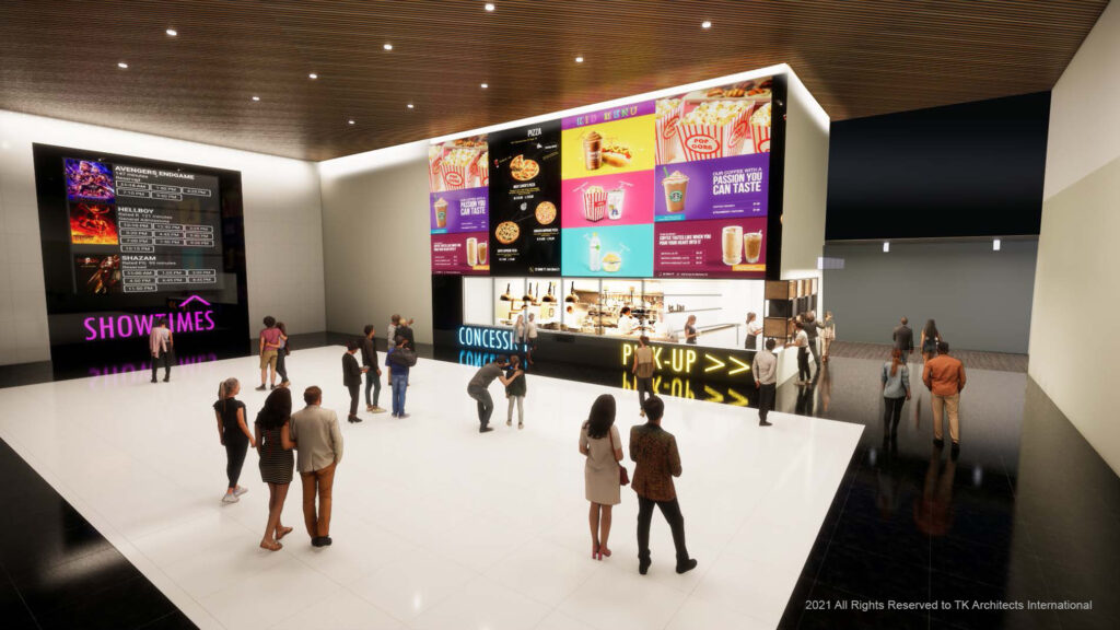
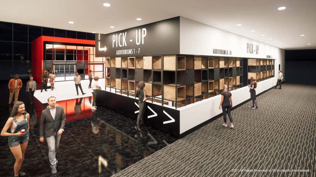
The transition to technologically enabled touchless service was occurring before the onset of Covid, but its adaptation was greatly accelerated.  The lobby and concessions envisioned below uses large graphics for visibility throughout the lobby, QR codes coupled with loyalty apps for ordering, and separated pickup conveniently around the corner.  The concession preparation area is enclosed with glass providing customer visibility into the kitchen while maintaining separation, cleanliness and avoiding direct contact between concessionaires and customers. 

What else have we learned from the pandemic? Without diving deeply into exhibition, the business partnership between studios and exhibitors has changed; by necessity during the “closure/lockdown” portion of the pandemic, and new rules on the relationship continue to evolve.  There is no doubt that this new relationship will result in a need for fewer auditoriums.  Movies will be in theatres for shorter periods and there will also likely be fewer exclusive theatrical release titles.  This should incentivize exhibitors to utilize auditoriums (and/or auditorium and lobby space) for other sources of revenue.     Among the diverse revenue-generating concepts are: 

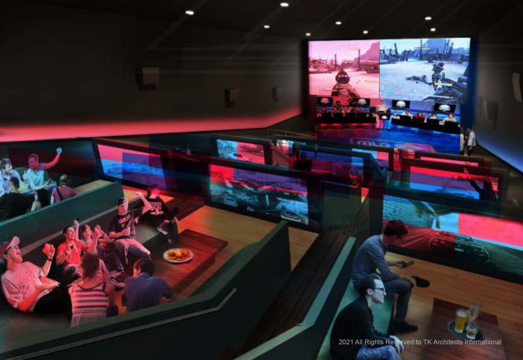
E Sports & Gaming

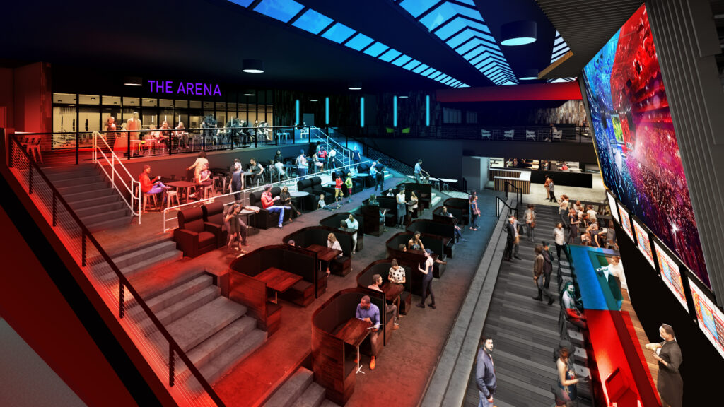
This is not an arcade but a competitive eSports and/or gaming space.  It can be a competitive coliseum (like the first image) or a more socially oriented space.  Either approach works well with auditorium-sized spaces, as well as for other uses and content.  These fast-growing markets will surely bring new customers to your facilities.

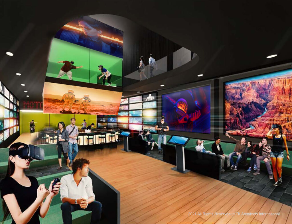
VR/AR/MR

Virtual reality, augmented reality, and/or mixed reality are key components of entertainment.  These gaming focused applications of technology are also “spectator sports’ and should be coupled with a bar and extended food service.  VR/AR/MR have also shown to be an effective medium for storytelling under the direction of skilled filmmakers.  There are exciting developments underway. 

Private Cinema (Flexible use Auditoriums)

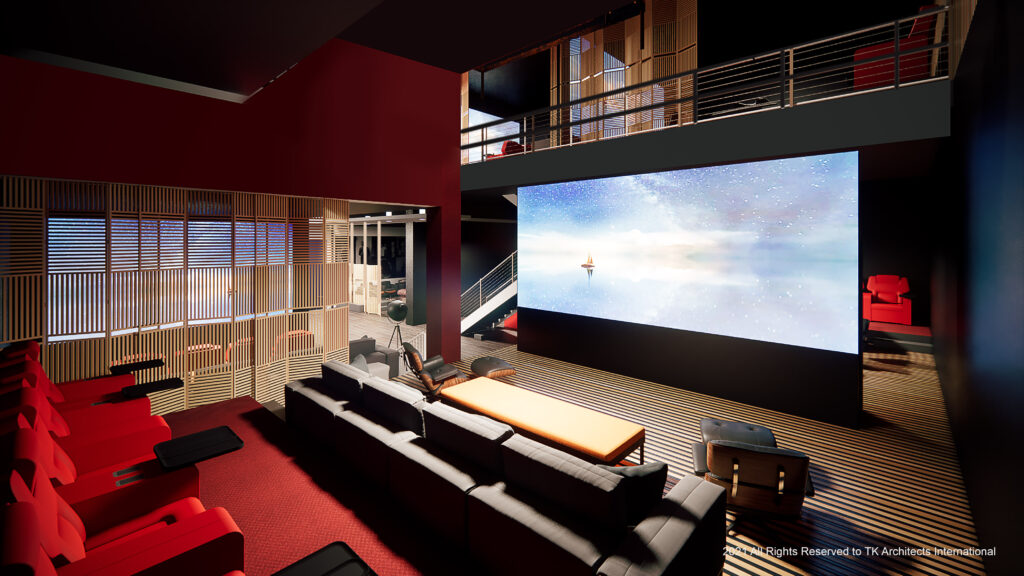
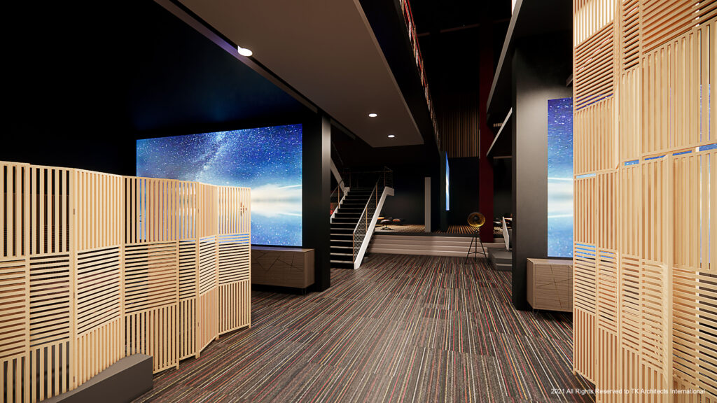
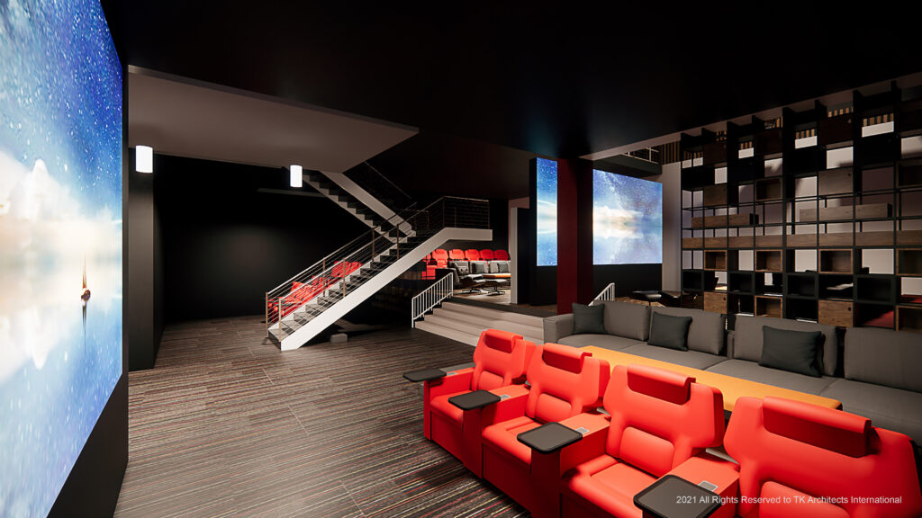
Private Cinema rental existed prior to the pandemic but provided a real lifeline to exhibition during it.  What if you designed small auditorium spaces for a variety of uses including traditional private cinema?  They are in essence a private entertainment space that can include first-run feature films, legacy films, subscription service entertainment, sports, music, esports, and other events, meeting space, karaoke, and virtual reality.  The key is designing them to provide multiple uses. 

Adult Lounge

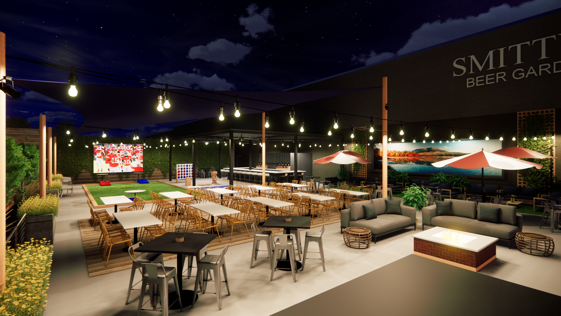
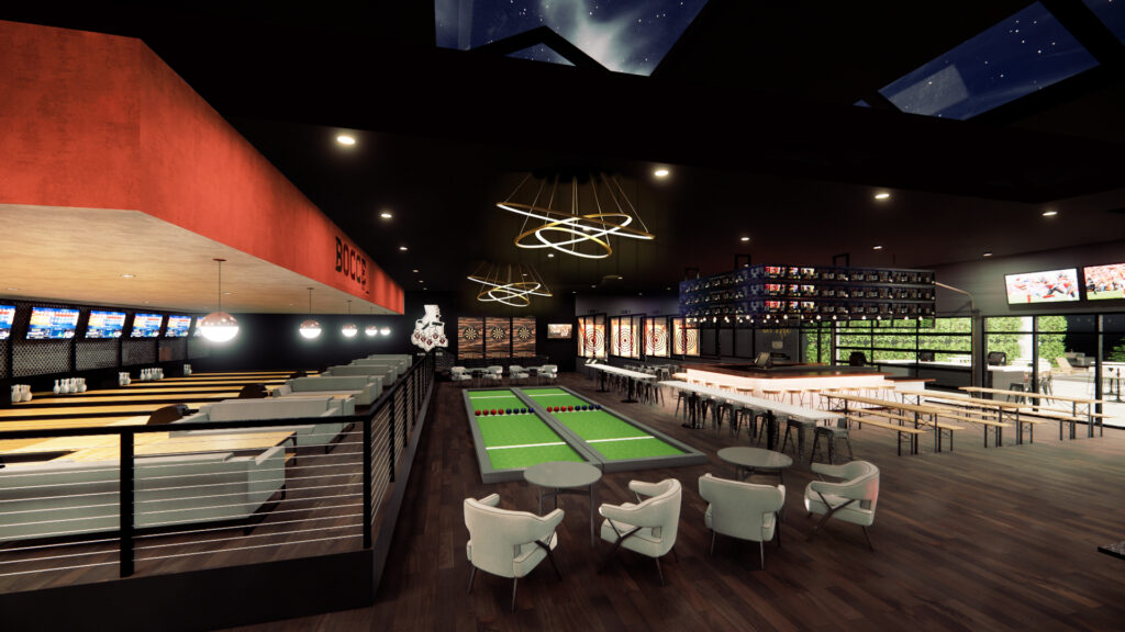
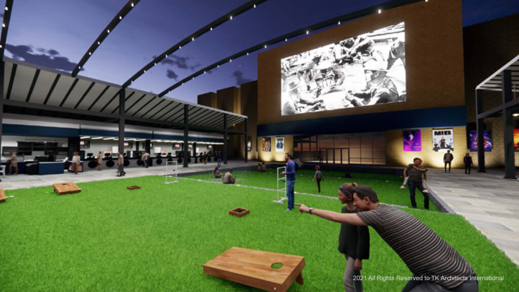
Many cinemas already include bars and expanded food services. What about providing adjacent entertainment options to keep customers there longer. Options include duckpin and mini-bowling, darts, billiards, pickleball, interactive walls, ax throwing, ping pong, foosball, air hockey, yard-zee, chess, Jenga, shuffleboard, cornhole, bocce, and countless others.

Outdoor Space as Revenue Generating

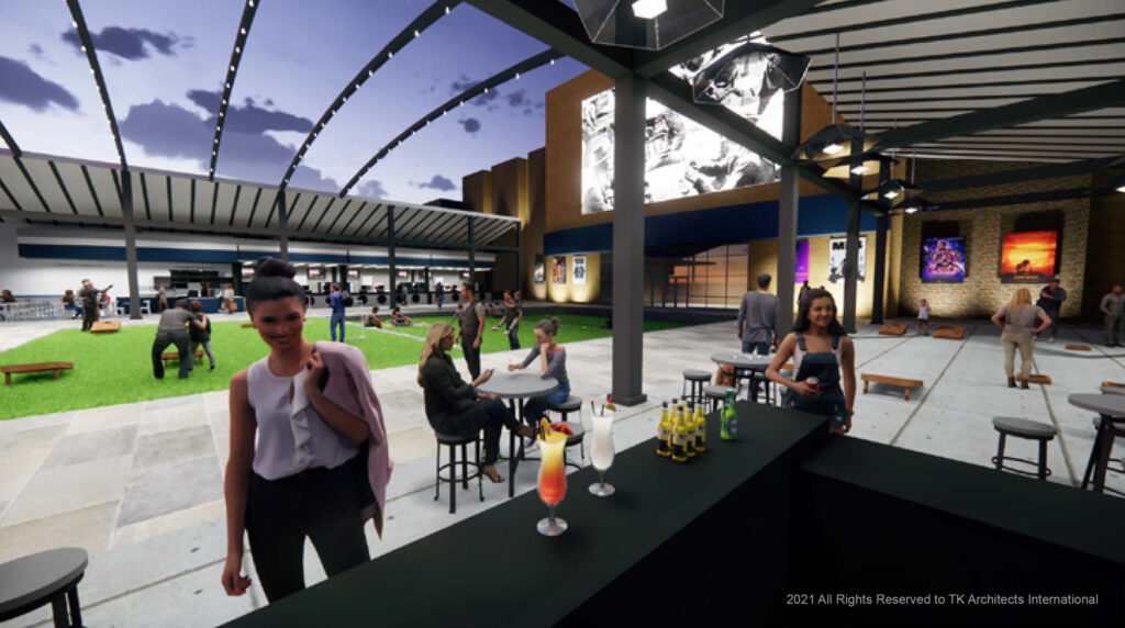
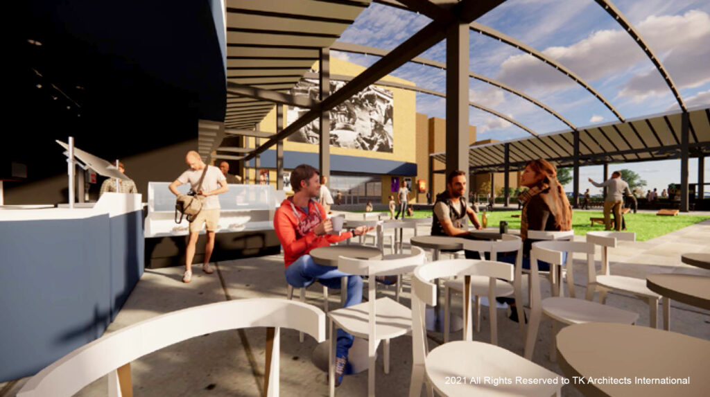
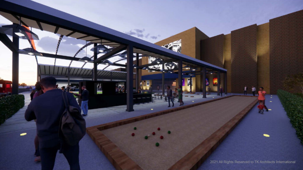
Can the space outside your building also be used to generate revenue?  If you changed your theatre from traditional to recliner seating, you may have more parking spaces than you need. Perhaps part of that space can be converted to revenue generation.  Drive-in theatres were the most common use during the pandemic.  Many people remain more comfortable gathering in outdoor spaces than indoor.  These combine to create a unique opportunity to monetize the parking lot and create a new first impression of your facility for your customers. 

Exhibition will be forever changed by the Pandemic.   It has survived for more than a century because it is resilient and changes with the times.  I believe that we have entered a new period of reinvention, and innovation.  Spurred by entrepreneurial exhibitors like Thomas Van de Weerd, Tim League, Bobbie Bagby-Ford, Crispin Lilly, and others who will be leading the way into the future and the next big things for exhibition. 

Michael Cummings Sr. Principal
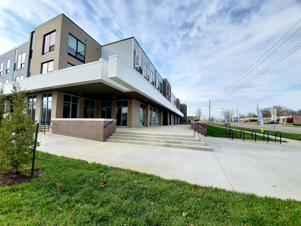
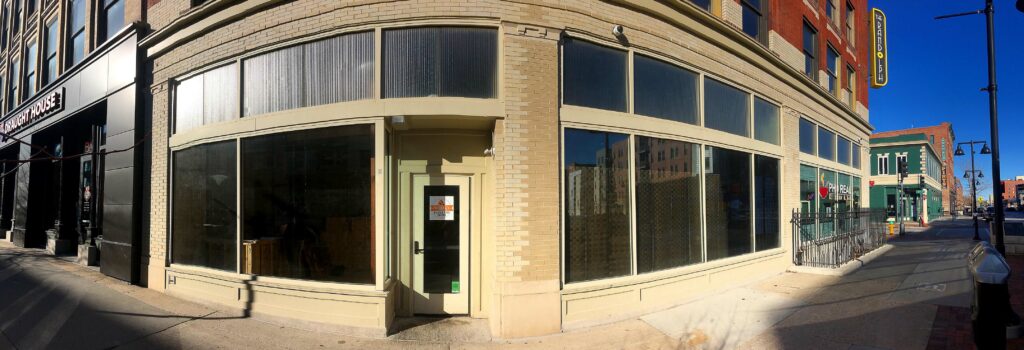
To Lease, Own, Build New, Re-use, or Renovate.

By | No Comments

JUNE 28, 2021 PRINCIPAL IAN WILSON

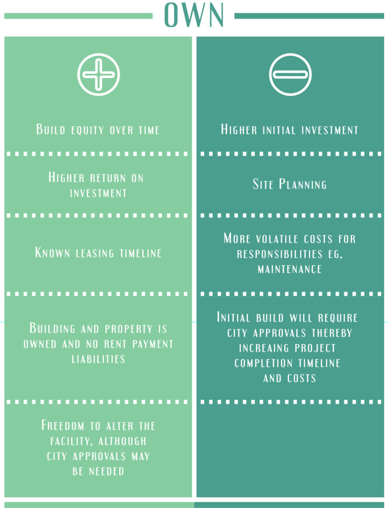
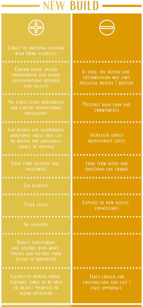
OWN OR LEASE? BUILD NEW? RENOVATE/RETROFIT? REUSE?

We are experiencing new signs of optimism and forward movement in the construction industry. More companies and financial institutions are undertaking new expansion and development programs, which in turn will increase the forward march of business and a much-needed social rebound.

The timeline to cultural and economic normalcy is still uncertain. Many businesses have been forced to operate on company savings rather than company profits and care must be taken. An important factor businesses are faced with, is, how much financial risk is too much.

There are many cost option considerations that can be explored by forward-thinking businesses.

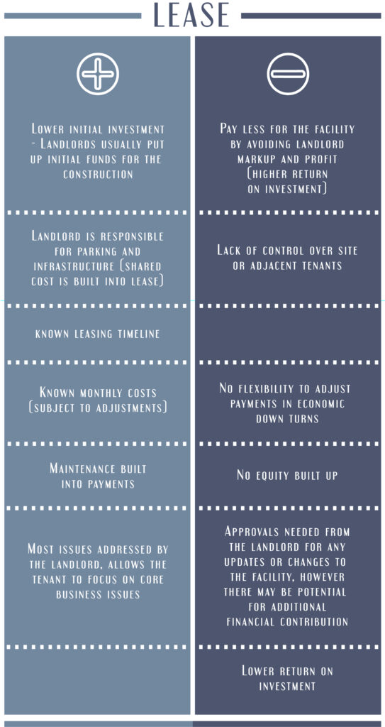
The first decision is should we own or lease? Once this is established, you need to decide the type of project you are interested in:

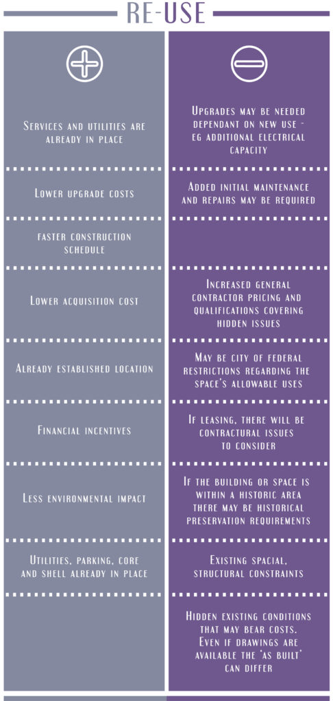
There are pros and cons to all of the above, so lets dig a little deeper:

PROJECT TYPES

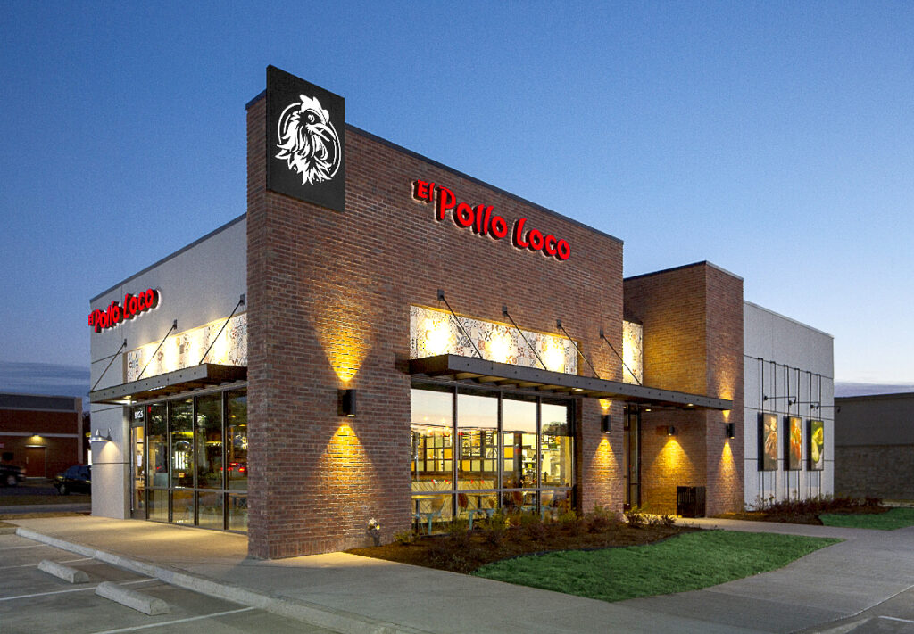
New Build – Developing and building a new facility from the ground up.

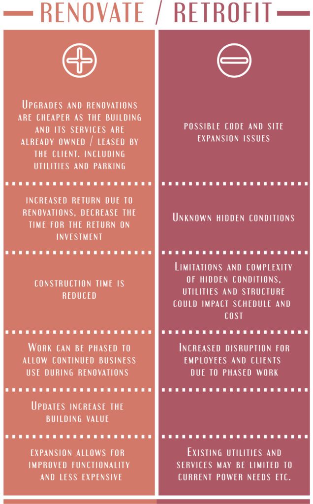
Renovate / Retrofit – Upgrade, change, add to an existing facility already in place.

Re-use – To develop an existing space that has been left vacant.

There is no one answer and many options. The web is complex but can be very rewarding to those that take the opportunities.

The items listed offer insight at most into some of the considerations involved in making a decision regarding the development approach. It is empowering and exciting to see the start of a revival in our lives. Long reign those businesses and entrepreneurs willing to step out and take the risks which end up benefiting us all. Investing in the growth of your company will pay off in the long run.

Principal Ian Wilson
TK Architects 40th Aniversary Celebration!

By | No Comments

TK Architects International is celebrating our 40th Anniversary as a firm. We wanted to reflect on our past, celebrate our present, and project our future. We wanted to share it with all the people that have joined us along this journey, including clients, contractors, vendors, friends, and family. As we have grown we have added services, sectors, and diverse international locales. Social media became the platform to bridge distance and a worldwide pandemic. We hope you enjoy the campaign and invite you to share your stories, comments, and memories with us.

Relive the anniversary content with us! Scroll through and see what TKA has been, and IS all about from past to present. Below is all of our anniversary content organized by sector.

Each image below is a playlist. Kick back with some popcorn, and see some History, and meet the people who built TKA. Also, enjoy content from: Cinema, Food & Beverage, and Entertainment!

We hope you will enjoy the content and join us on Facebook and LinkedIn to share some of your favorite moments with us!

Full youtube Playlist HERE: https://www.youtube.com/watch?v=4aZY9hedVAY&list=PLVqK0Gnu_6-gCnl2Zxps8jpDm5y-rXfre

TK ARCHITECTS HISTORY

Sr. Principal MIKE CUMMINGS kicks off our INTERVIEW SERIES and talks about how TK Architects got involved in the cinema industry. Follow along in this TKA HISTORY Playlist and hear from a number of our Principals including Jack Muffoletto, Tamra Knapp, Brad Reynolds, and more! This playlist is packed with TKA origin stories, memorandums, challenges, influences, and acquaintances that help to mold TK Architects into the industry-leading company that it is today.
(15 videos)

CINEMA

See where it all started in the CINEMA for TK Architects! Enjoy our story from the outside to the inside and all around. Grab some popcorn and join us down the promenade to the BIG screen!
(10 Videos)

FOOD & BEVERAGE

Food and Beverage is not only a stand-alone market sector. It spans across various market sectors as a component of them.  TK has worked on a variety of projects encompassing all ranges of Food and Beverage elements from small kiosks and self-service counters to full-service restaurants.  Having engineering in-house is a particular benefit to the Food and Beverage sector work as F&B equipment is specialized and required focused MEP engineering. When you add our special relationship with equipment vendors, the project work is streamlined for client success.
(5 videos)

ENTERTAINMENT FACILITIES

The evolution of TK Architects from Cinema to holistic Entertainment Facilities seemed to happen naturally due to the synergy that cinema and other entertainment opportunities bring. Entertainment Facilities offer a large revenue stream from Arcades, Bowling, Mini Golf, VR, AR, and Escape rooms.
(5 Videos)

Thank you for following along with our 40th-anniversary content and us over the years. We had a great time creating the content and hearing some of the stories from the past, from the people who built TKA to be what it is today.

Please follow along on social media as we open a new chapter in TK Architects history!

Wayfinding… how to get from Pandemic to Design

By | No Comments

MAY 24, 2021 Sr. Principal Jack Muffoletto
This pandemic has felt like a vice with constant pressure coming from so many directions…. Business decisions including employees and rent… keeping people safe… remote working… remote learning….
It feels like as soon as one issue is worked out, the situation changes and we are back to square 1.
Sometimes you just need to take a deep breath, maybe do yoga… or, what about creating something from nothing with good design.

In our business, there is always the need to create an experience to bring customers back. We are living in a time where a lot of us are experiencing new things as we work our way through these tough times and ‘getting back’ is something that we all have been waiting for. Some of us are just looking for a sense of direction. We are hoping we can provide a little direction. In today’s blog, we are talking about Signage and Wayfinding.  Most of our projects rely on a strong emphasis on graphics to enhance the guest experience.

Regal Cinemas Stadium 16, community inspired ‘mountain silhouette’ auditorium entry signage.

The goal is to impact the experience beyond just the functional aspects of the customer journey. For example, to engage the customer, we might think about connecting the client brand with the community that the facility exists in.  There could also be the idea of visually telling a story of a place through murals, wall graphics, art, wall hangings, sculpture, etc. This gesture works to foster the project as an important part of the community.  In fact, oftentimes it is an opportunity to uncover stories of a community that can be expressed and celebrated.

Regal West Oaks concession Mural in the Energy corridor of Houston.

The graphics and interior design should always support the overall design narrative of a project. Visual elements are strategically placed to immerse customers providing a visual cue that could be welcoming, directional, or even a selfie opportunity!

New technologies are available to assist the designer. Monitors can effectively be programmed for any function: wayfinding, ads, menus, etc. We realize clients want the flexibility to keep up with changes and this is particularly true when dealing with complex buildings and large groups of customers that need signage, and wayfinding.  Monitors can do this. The use of digital technology allows us to provide real-time information. Also, apps are available to inform the customer. After all, the mobile phone is everyone’s connection to the environment.

Digital content boards, Marcus Ypsilanti

Other tools are available to create a unique and memorable experience like storytelling. Consider what makes up the personality of the destination, like stories of the community, the owner, the history of the building…. What makes it special?  What is the personality of the destination?  Is it simple and memorable? …Is it timeless, a gateway, diverse, a landmark?  Every destination has a story and every story has a destination. Every destination, like people, is unique and different from one to the next.

The designer’s assignment is to provide our clients a clear understanding of the intended overall design experience of being in a specific environment and navigating that environment.  How do we translate a vision and concept into an environment? 

Core to the design process, we may start with one or several brainstorming methods like words and phrases, hand sketching, sticky notes, trace paper, white board, inspirational photos, etc.  To visualize initial ideas and to advance/eliminate good and bad ideas, we progress to preliminary plans and elevations that communicate scale and adjacencies.  A key detail or motif may be developed that is repeated.  A ceiling or light fixture, material, or any other element may become a feature.  The progression evolves to 3D modeling to study form, proportion and color.  Ultimately, realistic renderings are developed to help our clients understand the experience of the space.

Premium Conceptual Rendering

In general, people thrive on the social interaction that public spaces create. We fully expect people to be eager to be together again, out in a thriving public realm.  When they return signage and wayfinding will be the tour guide to their experience.

Trends for signage and wayfinding we expect to see include timeless, rather than trendy solutions. For that reason, we see the use of proven traditional materials like stained woods, natural stone, luxury vinyl, painted metals, brick, tile, etc., and pure geometries as a foundation of our design.  Traditional materials come in a variety of textures and tend to be more durable and have an attractive appearance.  Technology will continue to play a vital role.  AI and AR will continue to be more integrated.  But the basis of our focus relies on the integration of function, art, storytelling, placemaking, color, materials, lighting, etc. to bring people together, logically move them through designed space and elevate the human experience.

I can be grumpy when I am tired, stressed, hungry, and when things don’t go my way.  But there’s something inspirational about a good song, a stunning photo of nature, or a solid, well-thought-out design that pleases a client and provides a reset amid the stresses of the day, even if only for that one moment of pleasing interaction.

Couldn’t we all use a little more of that in our lives?

Sr. Principal Jack Muffoletto
Welcome to Bliss Point – Experiential Dining
By | No Comments

The new table, experiential restaurants are in vogue.  Dining out isn’t only about eating and drinking, it’s about the entire dining experience.  Diners want to feel like they are getting more than a meal.  They expect more out of their time at the bar or restaurant – they want that extraordinary experience.  They crave that “experience” that creates memories, and with this, they are willing to pay extra. 

With the influence of today’s technology and trends providing a memorable experience has become a necessity.  Today’s patrons are searching for that “new and exciting experience” it’s culinary wanderlust.  The basic elements of operating an alluring restaurant are still very important – great food, first-rate drinks, good service, cleanliness, and appealing design.  Blending the experience with the deliciousness of each bit is how to optimize your success.

Welcome to Bliss Point – experiential dining that looks to augment your experience with flavor!  Renowned American market researcher and psychophysicist Howard Moskowitz describes bliss point as “that sensory profile where you like the food the most.”  It is the combination of sugar, salt, and fat that act synergistically and are more rewarding than any one ingredient.  This is the same essence that is used in good design – the whole is greater than the sum of its parts.

Bliss Point is a case study that TK Architects has developed to create a uniquely designed space that puts experiential dining at the for-front.  The use of technology, innovation, quirky themes, unexpected strategies, and thoughtful design geared towards creating extraordinary encounters for your guest. The notion of creating immersive spaces that really drives the experience, consumers are responding to these extravagant forms of design and décor.

Bliss Point is entered through a portal intended to transport patrons from their daily rituals into a multi-sensory dining experience.  Patrons are greeted by a host, an astronaut, and their pet tiger (this place is Instagram heaven)!  The restaurant is organized around a central bar (be careful not to scare the flamingos) that provides views to each unique experiential dining room.  The experiences are as follows:

  • Experiential food museum – a hybrid space devoted to a cultural phenomenon of putting food on the art spaces table.  The gallery walls liven the museum space with peculiar art pieces.
  • Hipster family space – an era-specific space that conjures up days of the past and fun that only the undecade could bring!  The nostalgia-centric experience created by this space is one that is rooted in the desire of the traveler to feel connected to a world that they knew.
  • Pop-up dining event – the focal point here isn’t necessarily the food, but the combination of the senses that create something unique.
  • Multi-sensory dining experience – the use of projection mapping and active lighting enhance the dining experience.  The high-tech design allows for an ever-changing space and offers the patrons the ability to be transported anywhere as a paring component with the course.
  • Dining pods – social distancing at its finest, diners are cocooned in glass houses.  Individual pods let patrons experience intimate dining within an active space.
    • Experimental cocktail lounge – boozy lounge space that adds another layer to the experiential atmosphere bringing smoke and stage performers.

    Turning dining into an event may be the key to unlocking a higher check average. Check out the survey data from EventBrite:

    • 75% of people believe unique dining experiences are worth paying more for
    • 50% of people would pay more for the exact same menu if it had a chef interaction
    • 59% of people say cost does not impact their attendance but the menu, uniqueness, and location do

    So the stakes seem high for restaurant operations to excel at making every dining experience memorable.  Given the passion for adventure, it’s no wonder that consumers express a preference for paying for an experience rather a product.  Blending product and performance may be a recipe for success.  TK Architects is a leader in the experiential design market – let us help you in creating your dream.

    Chad H. Philhour