fbpx
Category

Blog

The C-Store Landscape

By | No Comments

by Mike Cummings, Sr. Principal

March, 21 2023

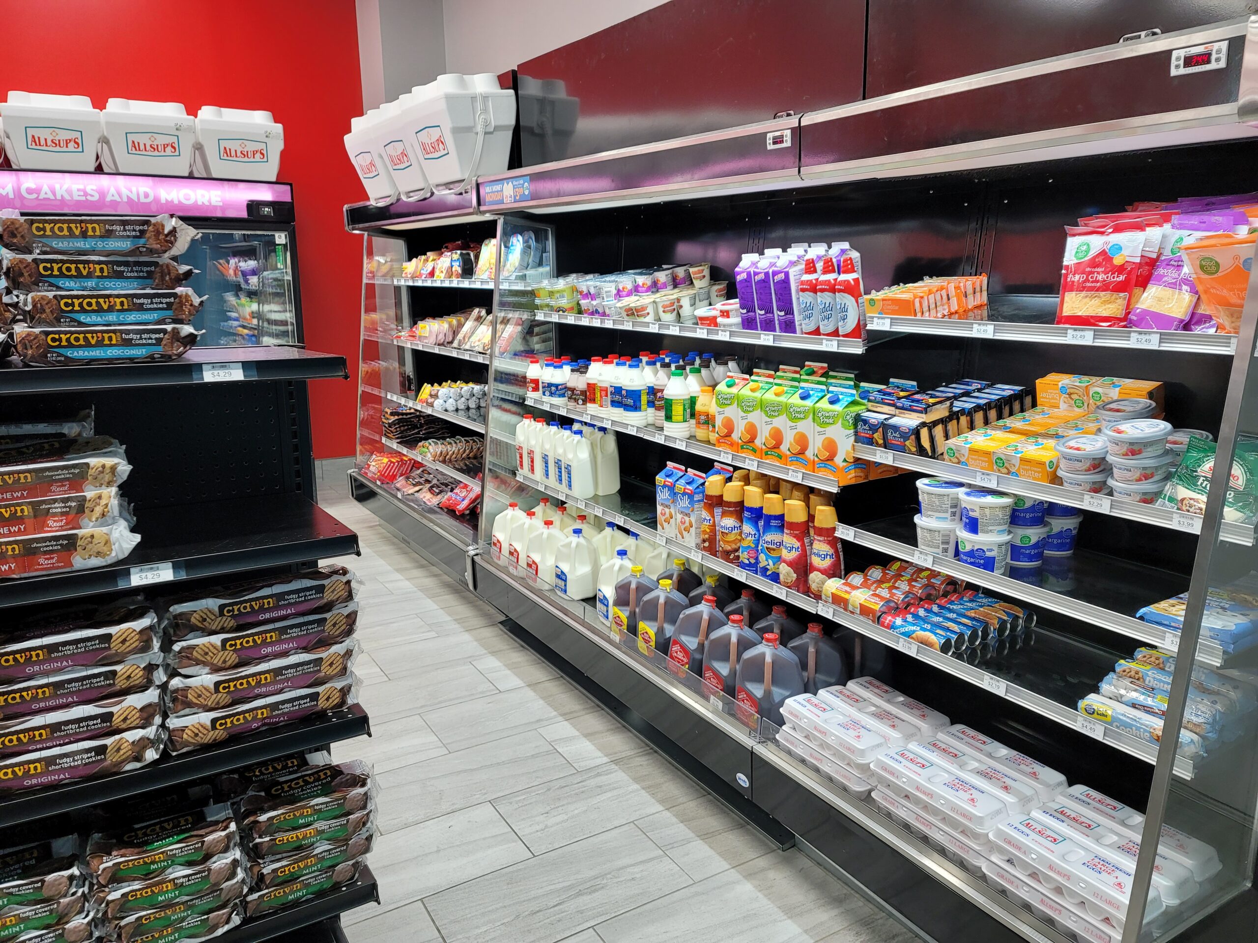
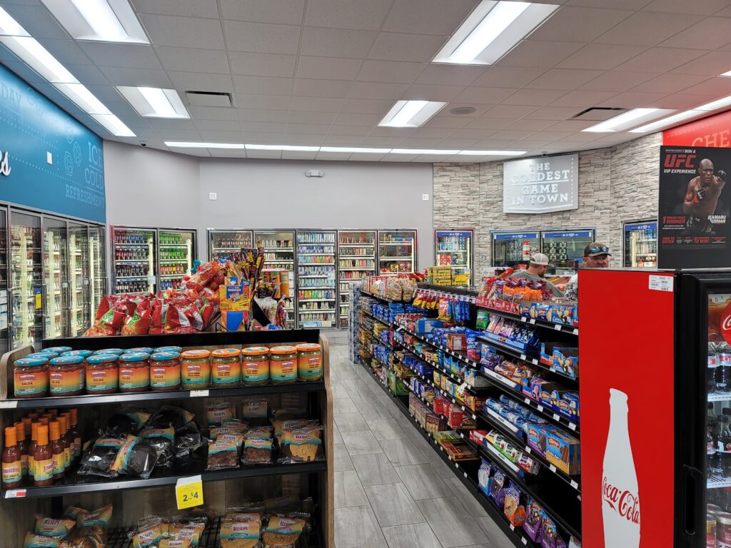
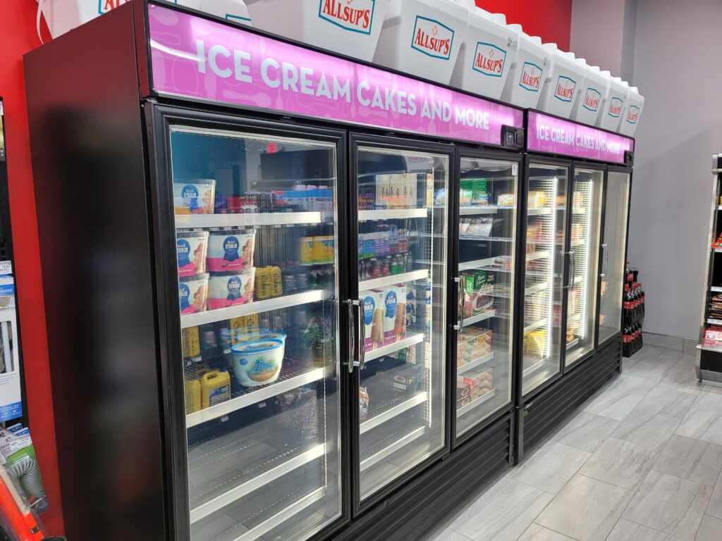
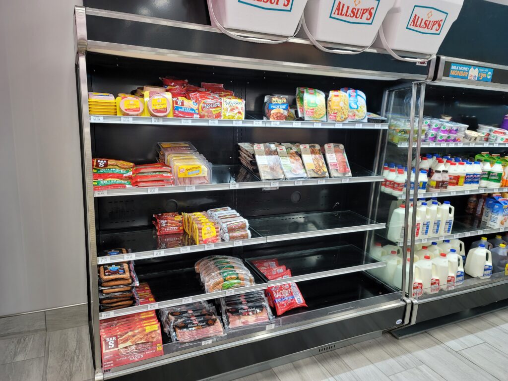
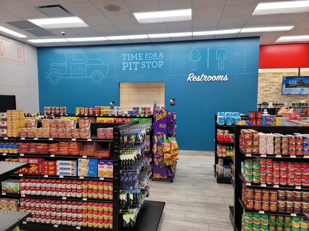
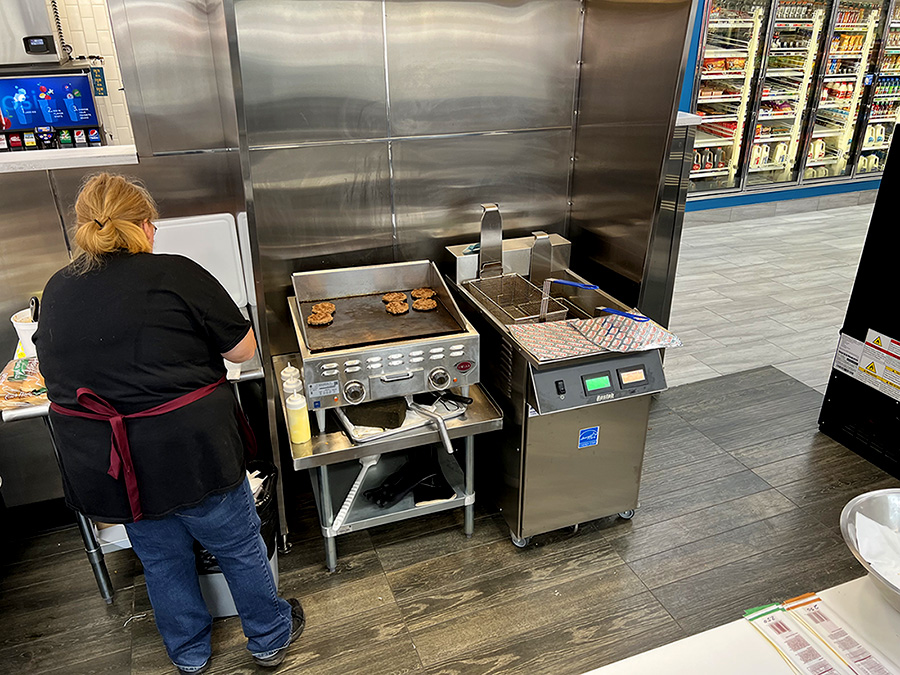
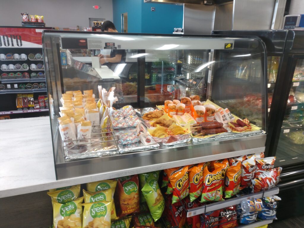
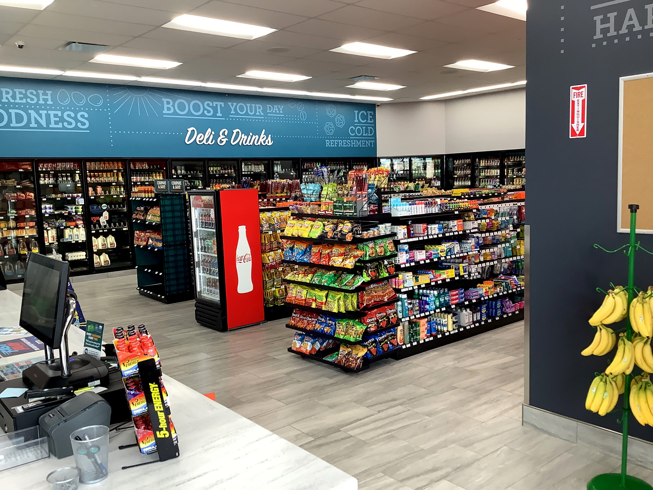
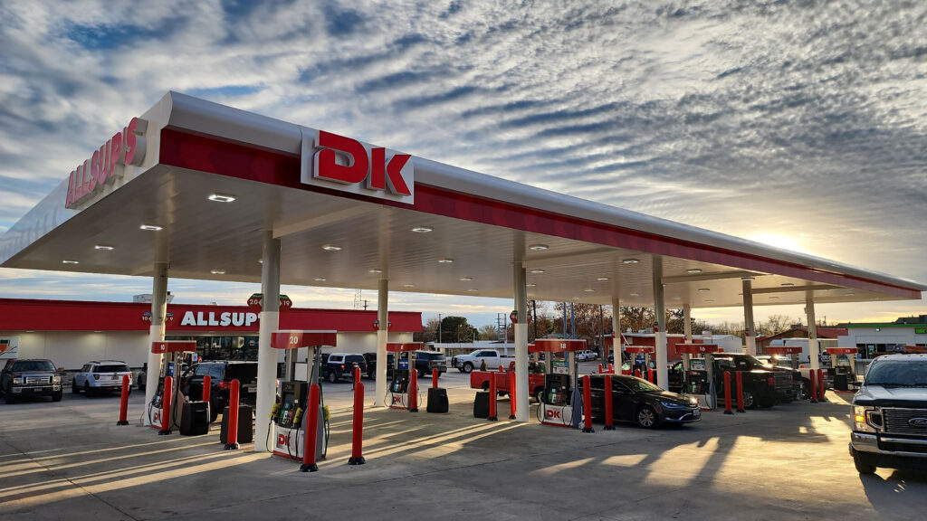
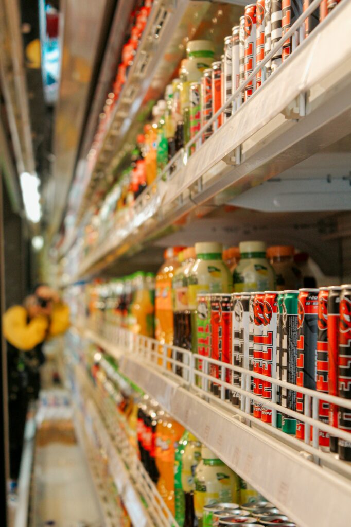
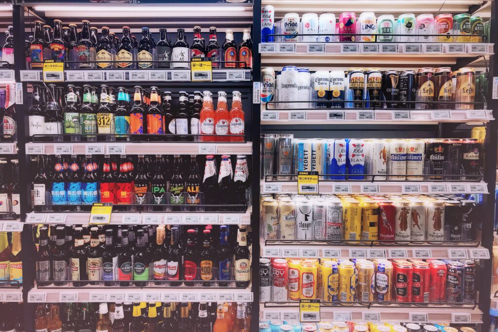
Convenience stores serve a variety of needs and continue to evolve.   Full disclosure – I am a fan of C- stores, both in my daily life and when I am on the road going to jobsites.  There are more than 150,000 C-stores in the US, and it is a half-trillion-dollar annual industry.  They may or may not sell fuel.  C-stores are evolving from the traditional “cokes and smokes” to becoming a destination and not just a place for gas and a cup of coffee.  C-stores come in all kinds of sizes from small walk-up non-fueling locations to the biggest in the world like Buc-ee’s. 

Most convenience stores fulfill a variety of needs so they can be difficult to categorize.  Among the primary needs that C-stores can fulfill:

Travel centers are generally large facilities with convenient auto and diesel fueling, large restrooms and lots of drinks and snacks.  Many have a restaurant incorporated.  Travel centers offer a welcome stop on road trips to stretch your legs and refuel. Other amenities that you might find at a travel center include:

  • dedicated truck and RV parking areas
  • Pet relief area (I had no idea so many truckers travel with a pet)
  • Expanded food choices.

Fueling convenience stores

The primary function of some C-stores is to sell fuel, with an assortment of snacks and beverages.  Many times, these may be the only fueling option in town or within miles. 

Grocery convenience stores

The primary function of some C-stores is to be the local grocery store; these may be the only grocery option within miles. These stores will also have an assortment of snacks and beverages, and other convenience items, and may also sell fuel.  Grocery is now the third most common category purchased at convenience stores, falling just below snacks and candy, according to data from NRS.

Urban convenience stores

These small, non-fuel locations are normally seen on an active, pedestrian street and cater to people living or working nearby.  I was quite surprised to encounter these types of C-stores while traveling internationally. One in Beijing on the ground floor of a high-rise office building features a steam table serving lunch to workers in the office building.

As I said, most convenience stores fulfill a variety of needs and fit within multiple categories.  The good news is that there are still many opportunities for new locations within all types of C-Stores. And for new types of stores.  Will the “lessons learned” during the Covid pandemic lead to evolution of C-stores or even new types of C-Stores? 

Stay tuned.

Mike Cummings, Sr. Principal
Reflection and Recap

By | No Comments

by Theresa English, Principal

February, 20 2023

For TK Architects, the gift of 2022 was growth.  After two very difficult years, we saw our efforts pay off with work from new clients.  We added a new Principal, Trevor Ruhnke, which is very exciting.  Leading the next generation of owners will be an architect, a Structural Engineer and a MEP Engineer.  We also doubled our staff including  some fantastic interns.  The talent that has joined us is so exciting and fresh.  We are seeing their growth daily. 

Cinema projects have started to reappear on our drawing boards (okay, monitors but that isn’t quite as elegant of an image).  Entertainment is showing growth too.  Renovation to update and augment amenities is widespread and growing.

Our F& B clients are kicking off national growth programs and expanding their franchisee rosters.  We’ve been working with them to develop their prototypes to allow this growth to be efficient and cost effective while offering the best guest experience.  I was able to attend the Food Service Equipment and Design Thought Leadership Summit conference in Chicago for the first time.  It was great to spend a couple days thinking about what the customer experience of the future restaurant will be.

We have further expanded our project types to include convenience stores.  These clients growth was being hampered by not being able to roll out drawings fast enough.  We were able to help them accelerate and increase their growth and surpass their desired location count by end of this year.

We are happy to leave the early 2020’s in the past.  In 2023, we look forward to adding new clients and more staff to help them achieve their goals.  Stay tuned for further developments!

Theresa English, Principal
Structural Definitions

By | No Comments

by Steve Petracek, Principal
JUNE 24, 2022

Communication can be very difficult. I could think I am saying one thing, but you might hear something completely different. It happens all the time in normal day-to-day conversations. How about when the subject is work-related and specific terms are used? The terms may be straightforward, but many people put different meanings or nuances to them. As some of you may know, I am also in the Navy Reserves and as I write this, I am in DC working on a reorganization of units, and a key phrase we keep falling back to is “words matter”. Meaning, that specific words need to be used at certain times, and they must be chosen carefully so that others understand them, and you can get your expected results.
Let me help with a better understanding of some technical words:

MEMBER – I used the word member almost a dozen times below, and not always in the same context. And in this case, it is exactly as Merriam-Webster describes it, “one of the individuals composing a group”.

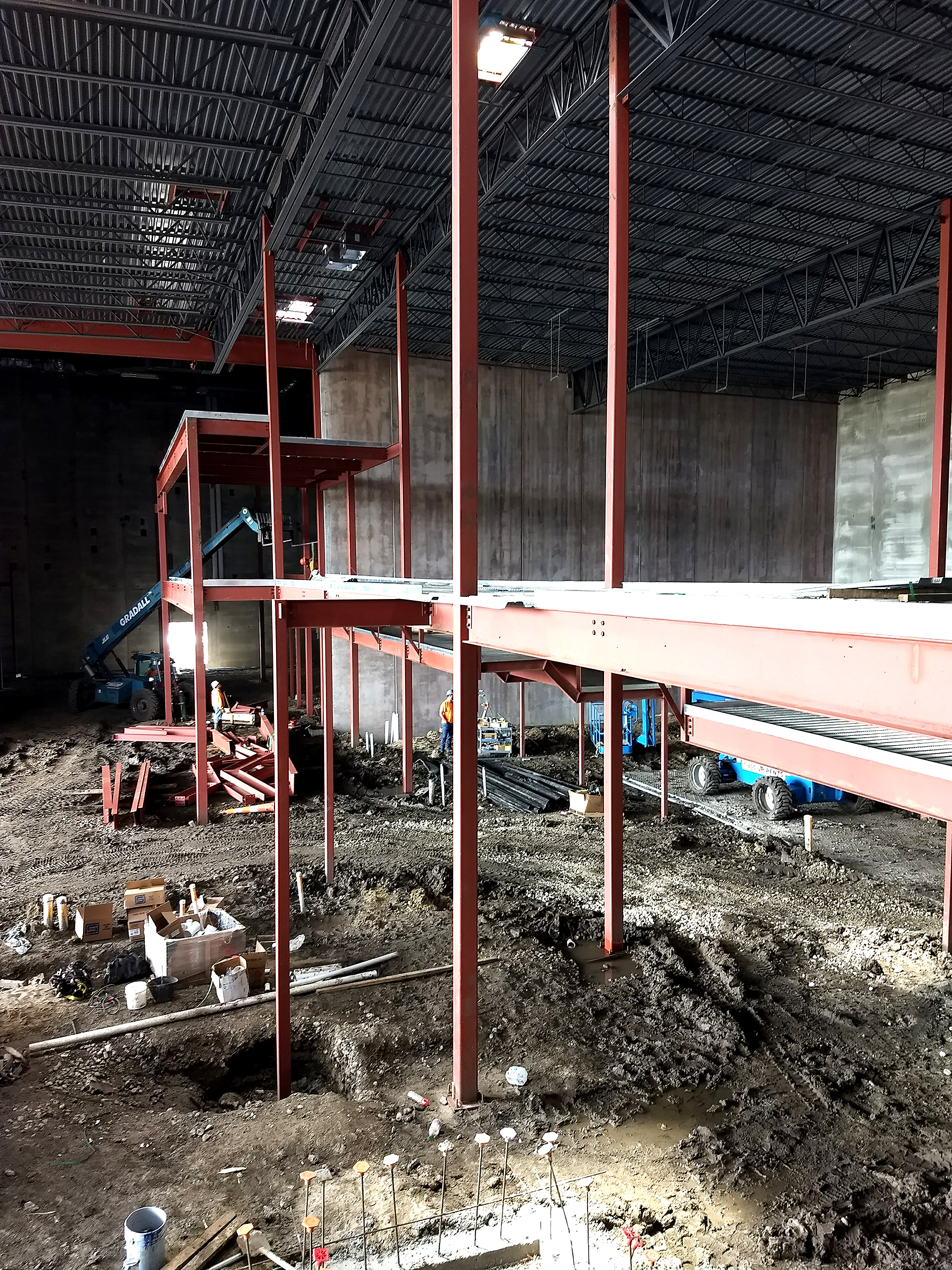
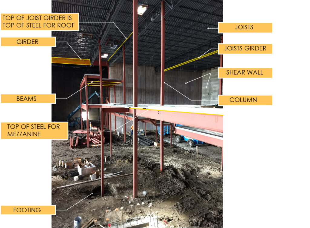
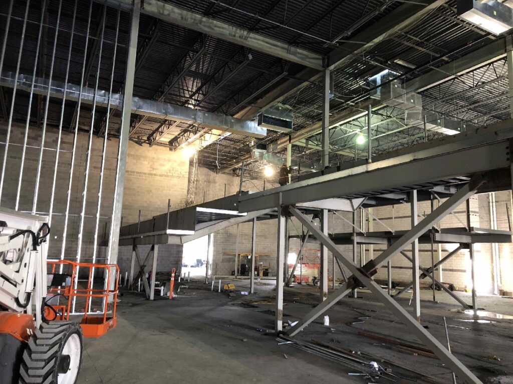
DECK – This is the first line of the load path as it carries the floor and roof and transfers the load to the beams. In addition to carrying the gravity load, it works to carry the lateral load to the lateral resisting members.

BEAM – This is basically any horizontal member. Structurally, I would call the beam the first member supporting a floor or roof. Which leads to the next definition, the girder.

GIRDER – Typically horizontal or predominately horizontal member that supports beams.

TRUSS – A built up section to reduce the weight of the member and span a longer distance than a typical W-shape beam or girder. Very beneficial in creating long and open spaces but more depth is required.

COLUMN – Typically a vertical member but not always at 90 degrees to the foundation. Columns will carry the loads of the beams and girders.

FOOTING – or Foundation but never footer (section at the bottom of a page) or footin’ (not sure what that is). It is the bottom of all load carrying members and used to distribute the load to the soil. It carries both gravity and lateral loading.

BRACE – This is a diagonal member that is used to brace or support other members. These can be X-braces, single diagonals, and K-braces among other types. These are the vertical members that typically get in the way of openings or blocking some form of opening and are used to, in most cases, resist lateral load created from wind, seismic, or seating loads.

STRUT – A horizontal member that resists a force in line with itself. These are typically located in the plane of a diaphragm. It helps transfer the load from the diaphragm across an opening to a load carrying member such as a shear wall.

SHEAR WALL – Constructed of CMU or concrete and works also as a load bearing element. Typically, they are around the perimeter of the building and in theatres, is sometimes used as a demising wall.

TOP OF STEEL – This can be confusing. Top of steel is measured as the top of the structural steel such as a beam or girder. It is not the top of the steel joist sitting on a beam. Coordination for the top of steel elevation is left to the fabricator in coordination with the joist supplier verifying joist seat depth.

I know this is not as exciting to most as it is to me, but this should help anyone on a construction site, or when dealing with engineers and architects.

The best story I have heard was from a fellow coworker that was out on a site visit talking with the contractor about the steel framing. Structural engineer site visits are early and there is minimal framing up in some locations. In one location the contractor kept describing the issue he was having with the beams. As the engineer surveyed the site, all she saw were columns. When she stated there were no beams out there, the response was, “they are right there, those vertical beams.” Then she understood. Once we all have the same definitions, we can better support and help each other.

Have more questions about structural vocabulary, or stories about coordination that you would like to share? Ask! Email me at spetracek@tkarch.com

Steve Petracek, Principal
Restaurants of the Future: Experience and Technology

By | No Comments

by Theresa English, Principal

February 23, 2022

Restauranteurs and designers are rethinking how they will be designing in the future. Some of the trends you see now started prior to the Pandemic.  Self-ordering, kiosks, and grab and go were a few but some, like AI-assisted ordering, were accelerated by technology developments that happened during the Pandemic.  The typical time frame for technology development was greatly compressed by the need for innovation created by the Pandemic.   The events of the last couple of years are leading the way for these changes. Curbside is here to stay. Drawing people into a physical restaurant becomes more of a challenge.  Combining automation with the dining experience makes a new experience to pull customers away from their couch and the drive-thru.

Creating the experience: Customers want to be entertained. Food prep is one source of great entertainment. My nieces and nephews favorite restaurant was an open kitchen wood-fired pizza place. They would drag chairs over and press their noses against the sneeze guard. When they were watching, instead of pressing the dough into the pan, staff would toss it in the air and the kids would go wild. They were amazing and patient and would answer questions and chat with their audience. That kindness kept us coming back.  Panera announced their “Bakery Theater Experience” earlier this year.  The Krispy Kreme in Times Square includes an amphitheater.  The flagship Starbucks in Chicago includes roasting that patrons can see.  These restaurants create an allure for guests that can keep them coming back.

Automation:  The pandemic has already advanced apps, artificial intelligence, and online ordering, the next innovations will be staff efficiency. The push for increasing food industry wages has been exacerbated by the shortage being seen now.  The staff shortage contributes to the need for efficiency.  Automation is key for the future. Automation development has accelerated and now there are more options for preparing any type of food. Whether it is artisanal coffee or a full meal with sauces and a variety of ingredients. And do not forget the alcohol. One of the benefits of automating alcohol-related services is widening the pool of potential hires because you no longer need staff to be older.  Japan has probably the most extensive existing automation in restaurants, including arcades that are all claw machines for food.  The intrigue of seeing automation at work ties directly into the new experiences restaurants are looking to create.

The combination of curbside and automation makes for a great kitchen theater for those patrons dining in. Curbside makes for more food being prepared which provides more activity during a guest visit. Making the process visible provides something for guests to watch and enjoy.  Adding in automation imbues it with curiosity and allows staff to be more customer-oriented.  The patron experience will continue to expand. Design is the thread that will allow the multiple aspects to be woven together.

Have more questions about the future of the restaurant experience? Ask! Email me at tenglish@tkarch.com

Theresa English, Principal

Get the Most Value from Your Renderings: 5 Tips for Clients and Project Teams

By | No Comments

Date ##, 2021 PRINCIPAL STEVEN DRAGAN

In the year 1415, Filippo Brunelleschi blew Italian Renaissance minds with the formalization of linear perspective.  It became possible to accurately draw a 3d building that had yet to be constructed.  For Architects, this method of 3d rendering worked for almost 600 years with few innovations.  Then came computers…and now our capabilities change daily.

With the right hardware, software, and a talented team, we are able to create immersive animations for the projects we are designing.  We can utilize software to analyze each space and find conflicts.  We even have the ability to hold VR meetings inside of the building that is being designed.  Scan the QR code for a small taste of how we can visualize a space:

Go ahead… Scan me! You know you want to!
(Or click HERE if on mobile)

But how do clients feel about this architectural software arms race? Do you feel like you are getting more value?  As someone who leads a team of designers and works with this technology every day, I can attest, there IS incredible value to be had! However, depending on your specific needs (and budget) there is a point of diminishing returns.  Below are 5 tips to make sure your project squeezes the most value from architectural rendering.
Early rendering for a destination auditorium in a theme park.
1. ESTABLISH THE PURPOSE OF A RENDERING

There are 3 main reasons we make renderings: Marketing, Testing a Design, and Presentations.  Each has a different focus, time requirement, and final product.  When the client and the architect are clear on purpose, we can tailor our effort.  For example, when a client is penciling out a business plan for a prospective site, we may be asked to develop a simple floorplan and exterior rendering to generate interest and investment.   With this in mind, we craft an exciting image focused on the big picture.   By contrast, a design presentation rendering that is focused on fine-tuning of materials, transitions, lighting, and wayfinding would require much more effort.   The extra effort may have tremendous value in communicating what the final product will be prior to beginning construction documents. 

2. TARGET YOUR VISUALIZATION

One way to blow a budget is to over-render (i.e., model more spaces than are necessary).  To make sure our clients get value, we provide a list of views we will develop, then provide initial black/white views to confirm what is shown. Then we focus on creating renderings of those spaces.  So instead of detail-rendering every restroom in a facility, we’ll select a representative room to develop that view and communicate the design.   This targeted approach is part of a bigger design process with checkpoints that we map out with each client.

Restroom Rendering for Design Development Phase.
3. DO LIVE REVIEW

After years of weeklong rendering queues, we now have the ability to create real-time renderings.  Here’s what this means for our clients: we can get on a Zoom call and give them a photo-realistic tour of the design progress for their building.  These live progress reviews enable quick clarity about design intent and quick feedback.  If both you and the architect are okay with a less formal peek under the hood, this can simplify a weeklong back and forth email loop into a productive hour with clear follow-up.  Time-saved, budget saved, value-added.

4. GET THE FRINGE BENEFITS

Light Level Map.

Turns out, the effort needed to 3d model a design coincides with several other important parts of the project.  Having this level of accuracy and development allows us to also check for conflicts, quantify materials, test light levels, and more.  On their own, these efforts are significant, but once a design is modeled to the point of rendering, these benefits are within much closer reach.

5. SHOW IT TO THE CONTRACTOR AND PROJECT TEAM

Once you’ve spent the time and effort to develop images that show the experiential quality of a potential space, use it as a team resource.  While these images don’t illuminate the construction methods (nor should they!); can do a lot to get people oriented as they dive into a construction document set, ultimately, saving time and greasing the tracks for efficient communication.

In the world of architecture, we have more capabilities than ever before.  This will only continue to grow.  Make sure you get more benefits by finding an architect who communicates well and seeks to understand your business. (Here comes a bit of self-promotion) At TK, we’ve served entertainment and F&B clients for 40 years.  We’ve seen their businesses grow and change.  We are focused on bringing value at the right time, not just to rendering but to the whole project. 

Curious how we hand-craft our client’s design experience to meet their goals.  Drop me a note! sdragan@tkarch.com

Steven Dragan, Principal